Most “Selling” On-Chain Isn’t Selling
Every on-chain data provider miscounts it. A per-lot, cross-chain ledger can measure it exactly. I built one, and this is the first thing it told me.
THE QUIET BUILD
I built this in the quiet. Through a brutal stretch for digital assets, with capital fleeing, desks closing, and the loudest voices calling the end, I stayed heads-down building on-chain analytics infrastructure that doesn’t exist anywhere else. No raise, no press, no token, just nights and weekends around a day job. I’m showing it for the first time now, on the far side of a capitulation that at its late-June depth left nearly 78% of all Ether underwater, because this is exactly the kind of market I built these tools for, and because I’d rather lead with a finding than a pitch. The finding is the point. Nobody else can compute it, and it changes how you should read one of the most cited numbers in the sector.
The claim, plainly: the majority of what every on-chain data provider reports as Bitcoin “selling,” by value, isn’t selling at all. It never changed hands. It’s an artifact of how the Bitcoin protocol works, and the standard metrics have been silently counting it as real economic activity for years. Ethereum has the same blind spot through a completely different mechanism, at a fraction of the scale: it peaks near 10% of disposal there, against an outright majority on Bitcoin. I can show both, side by side, on identical methodology, because I built the per-lot foundation you need to see it. As far as I can tell, nobody else has.
That last sentence is why this note exists. Most on-chain analytics runs on aggregate snapshots: how much moved, how old it was, roughly what it was worth. That’s enough to reproduce the standard metrics everyone quotes, and not enough to ask the question that actually matters, which is whether a given movement was an economic event at all. To answer that you have to track every unit of supply at the level of the individual lot: when it was acquired, at what price, and whether a later movement was a genuine change of ownership or just the protocol shuffling coins between an owner and themselves. So that’s what I built.
01The Bitcoin number nobody reports
On Bitcoin, every spend works through UTXOs, discrete chunks of coin that get spent whole. Send 0.3 BTC out of a 1.0 BTC chunk and the protocol doesn’t subtract 0.3 from a balance. It consumes the whole chunk and creates two new ones: 0.3 to the recipient, 0.7 back to you. That’s your change. On-chain it shows up as a freshly created coin moving out of an old one, and to any metric that counts coin movement it looks exactly like disposal. It isn’t. It never left your control.
I measured how much of apparent Bitcoin disposal is actually this kind of non-economic change, and I didn’t do it on a sample. I classified every output Bitcoin has ever produced, all 3.82 billion of them, and reconciled the result to the chain. The answer, under the strictest same-owner test alone: 50.2% of apparent Bitcoin disposal by value is non-economic change. An outright majority, and roughly 74% in recent eras. The strict test is also structurally blind to the most common modern pattern, wallets sending change to fresh addresses, so the true share is higher still. Which means the standard indicators built on raw disposal, the realized-profit and coin-age numbers quoted across the sector, are counting roughly twice the actual economic activity. Half of what gets reported as Bitcoin holders selling is coins being handed back to the people who already owned them.
One category deserves a flag because it cuts against a popular narrative. CoinJoin and privacy mixing, which soak up enormous attention, account for less than 0.4% of disposal by value in most years. Loud in the discourse, nearly invisible in the data. The distortion is ordinary change, not exotic privacy activity.
02The same blind spot on Ethereum, through a different door
Ethereum doesn’t use UTXOs. An address holds one balance that goes up and down, so there’s no change in the Bitcoin sense. But the same class of distortion gets in through a different door: staking deposits, bridge transfers, and exchanges moving coins between their own wallets all reduce an address’s balance without any change in economic ownership. A standard metric reads those as disposal too.
Because I built the identical apparatus on both chains, I can put them in one frame. No single-chain shop can draw this comparison, and not for lack of trying. You need a per-lot, movement-classified ledger on both chains at once.
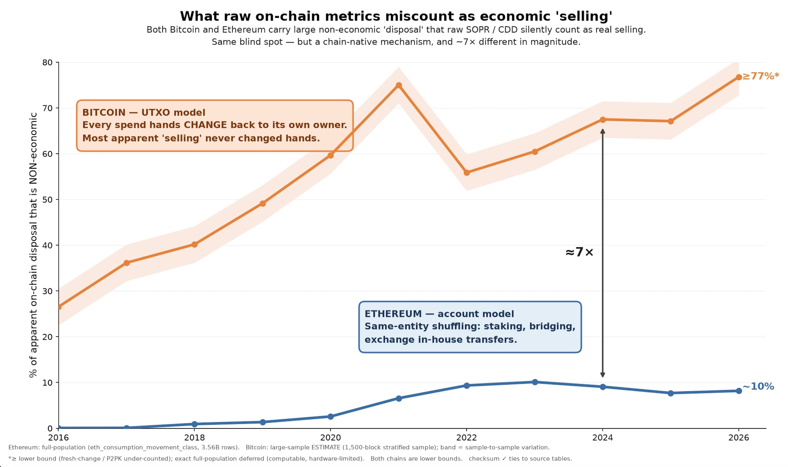
The shapes are genuinely different, and I drew them at their true magnitudes rather than forcing a parallel. On Ethereum the distortion peaks near 10% and comes from same-entity shuffling. On Bitcoin it’s the dominant feature of the raw data, an outright majority of all disposal by value, and it’s ordinary change. Same disease, completely different anatomy. That’s exactly why you can’t analyze one chain with the other’s assumptions, and why the standard practice of porting Bitcoin-era metrics onto every chain quietly mismeasures most of them.
The same foundation makes something else possible that no aggregate dashboard can touch: the cost-basis terrain of each chain, a map of how much supply was acquired at each price, placed at its true level relative to today’s price. Since I know the acquisition price of every unit of supply, I can draw the actual landscape of who’s in profit and who’s underwater. And since the method is identical on both chains, the two landscapes become directly comparable the moment you put them on the same break-even axis.
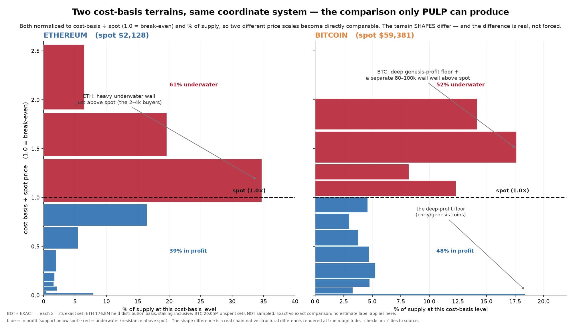
This is what I mean by analytics the dashboards structurally can’t produce. You can’t approximate a cost-basis landscape from aggregate data; you need the acquisition price of every coin, on every chain, in one consistent framework. And it tells a specific two-act story. In the June drawdown the entire $1.5k to $2k cohort, roughly 23% of all supply, flipped from profit to loss as price fell through their basis. In July’s recovery they crossed back into the green. Watching more than 40M ETH cross the waterline in each direction is what capitulation and repair look like at the lot level, and it’s invisible to any metric that doesn’t track cost basis. The fact that the terrain shapes differ across the two chains is itself the deeper point: it’s chain-native structure, the kind that disappears the moment you force every chain through one borrowed template.
03A convention that marks nothing, on either chain
There’s a number buried deep in on-chain analysis: 155 days. It’s the conventional threshold separating long-term holders from short-term holders, on the theory that coins held past roughly 155 days behave fundamentally differently. Nearly everyone uses it. I tested whether it marks any real change in behavior, with a method I fixed in advance so I couldn’t tune it toward a convenient answer, and I ran the identical test on both chains so the comparison would be airtight.
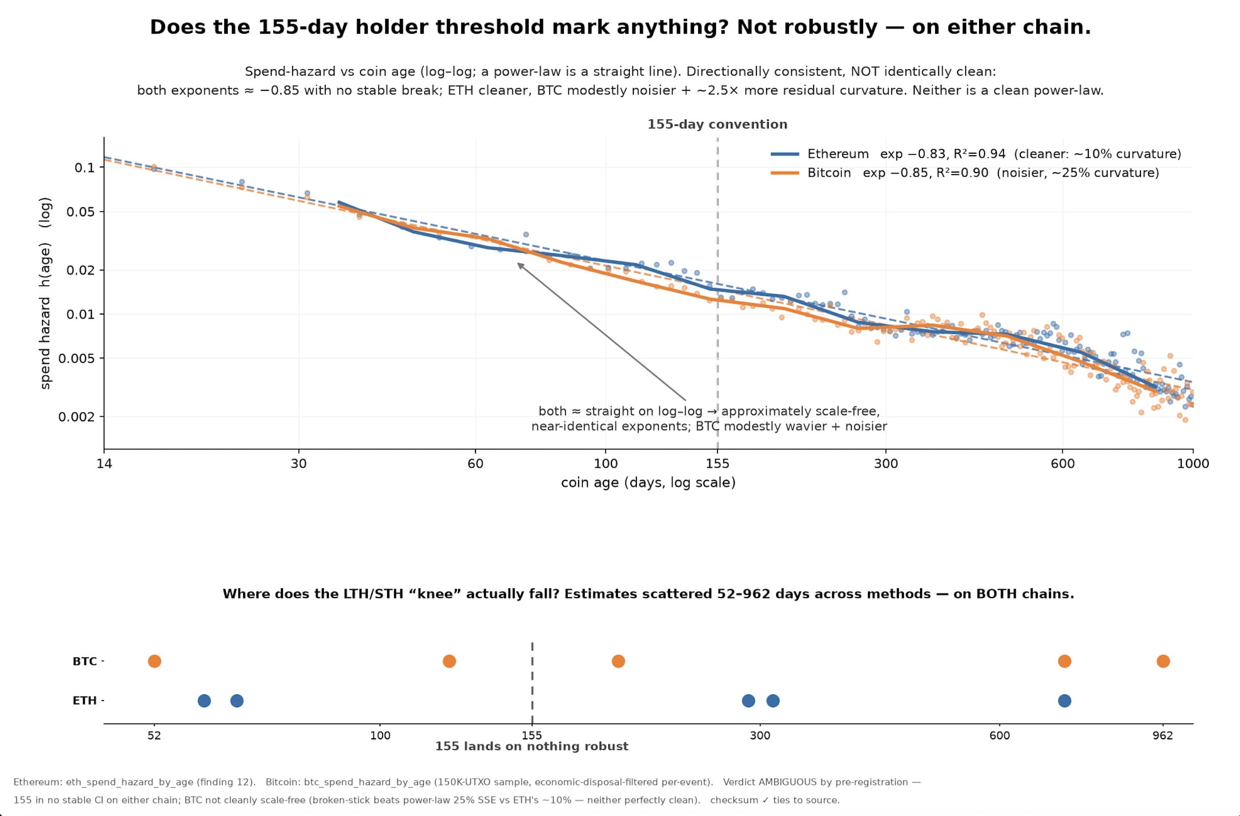
The result, on the part that’s clean: 155 is not a stable threshold on either chain. Estimate where the supposed long-term break falls using different reasonable methods and you get anything from 52 to 962 days. The convention marks nothing robust. Now, here’s where I’ll be more careful than the easy version of this story. It would be tempting to declare both chains perfectly scale-free and the threshold universally debunked, with a flourish. The data doesn’t fully support the clean version: Bitcoin carries modestly more residual curvature than Ethereum, and neither chain is a perfectly clean power law. So I’ll report what’s actually true. The 155-day convention marks nothing robust on either chain, and the two chains are directionally consistent but not identically clean. I found the messiness myself and I’m telling you about it, because a finding you have to walk back later is worth less than a smaller one that holds.
04Who’s behind this, and why it’s different
PULP Research is my on-chain analytics shop, built from the ledger up. The foundation is a wei-exact and satoshi-exact, per-lot cost-basis record of Ethereum and Bitcoin: every unit of supply tracked from acquisition, with the price it was acquired at and its full movement history. On top of that sit valuation, behavioral, cohort, and regime analytics, plus the movement-classification layer that separates real economic activity from the protocol noise the standard metrics miscount.
Three things separate this from the dashboards you already know. It’s per-lot, not aggregate, which is what makes findings like the ones above computable at all. It’s cross-chain on identical methodology, so Ethereum and Bitcoin compare directly instead of through two incompatible lenses. And it’s auditable: every number reconciles to the exact on-chain supply, and the market-state read decomposes to the specific signals driving it instead of arriving as a black-box score you’re asked to trust.
The implementation stays proprietary for now: how the ledger is built, the classification heuristics, the reconciliation machinery. The findings, the reasoning, and the honest bounds I’ll publish openly, because demonstrating the work is the point. There’s a great deal more where this came from. A full cross-chain, cohort-resolution market-state system arrives over the coming notes.